
Massimo Vignelli is likely the most influential designer you have never heard of.
Yet, if you’ve ever used the NYC Subway, carried a “Big Brown Bag” from Bloomingdales, or flew on American Airlines (before 2013), you’ve been guided by his invisible hand.
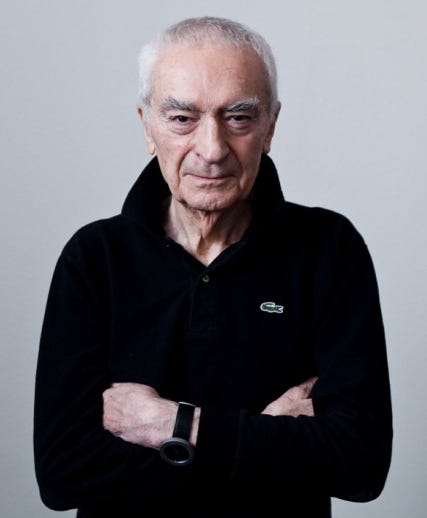
Born in Milan in 1931, Massimo was fascinated with art and design at a very early age. Formally trained in architecture (though never finishing his degree), Vignelli was first hired as a draftsman for an Italian Firm. In 1957, he realized his passion lay not in physical buildings and structures, but with their renderings. This led him down a winding path that ended with the enlightenment of realizing his passion was design.
Armed with what little money he had, and a dream, he arrived in New York City for a design fellowship. There he learned the art of metalsmithing, designing forks, spoons, and other cutlery for a popular kitchen product firm. He returned to Milan in 1960, but by then his realization that a life lived without design was one wasted. In 1966, Massimo was tapped to be a founding member of Unimark, a company that would be one of the most reputable design firms of the 1970s. He and his wife moved back to New York City, where he would spend the rest of his life.
At Unimark, Massimo’s focus was around designing logotypes and corporate identities for some of the biggest companies in the world, including American Airlines, Bloomingdales, Knoll, the US Parks Service, and more.


What drew people to Vignelli’s work was its utter simplicity. In the 1960’s, design was going through a rebirth. This marked the exact era when businesses began discarding complex illustrative branding for unified, highly disciplined, simple grid-based design systems.
Notwithstanding his initial success and iconic designs, Massimo’s magnum opus wouldn’t be for another 10 years after founding his firm, when he was selected to design the new New York City Subway System map.
Obsessed with geometric proportion and tasked with bringing order to something increasingly confusing and complex, Massimo refused to let the mess of New York City’s three very distinct transit systems and over 468 operating stations win against his perpetual quest to simplify the everyday and to fight against what he called ‘visual disease’; removing all the unnecessary noise in a piece.
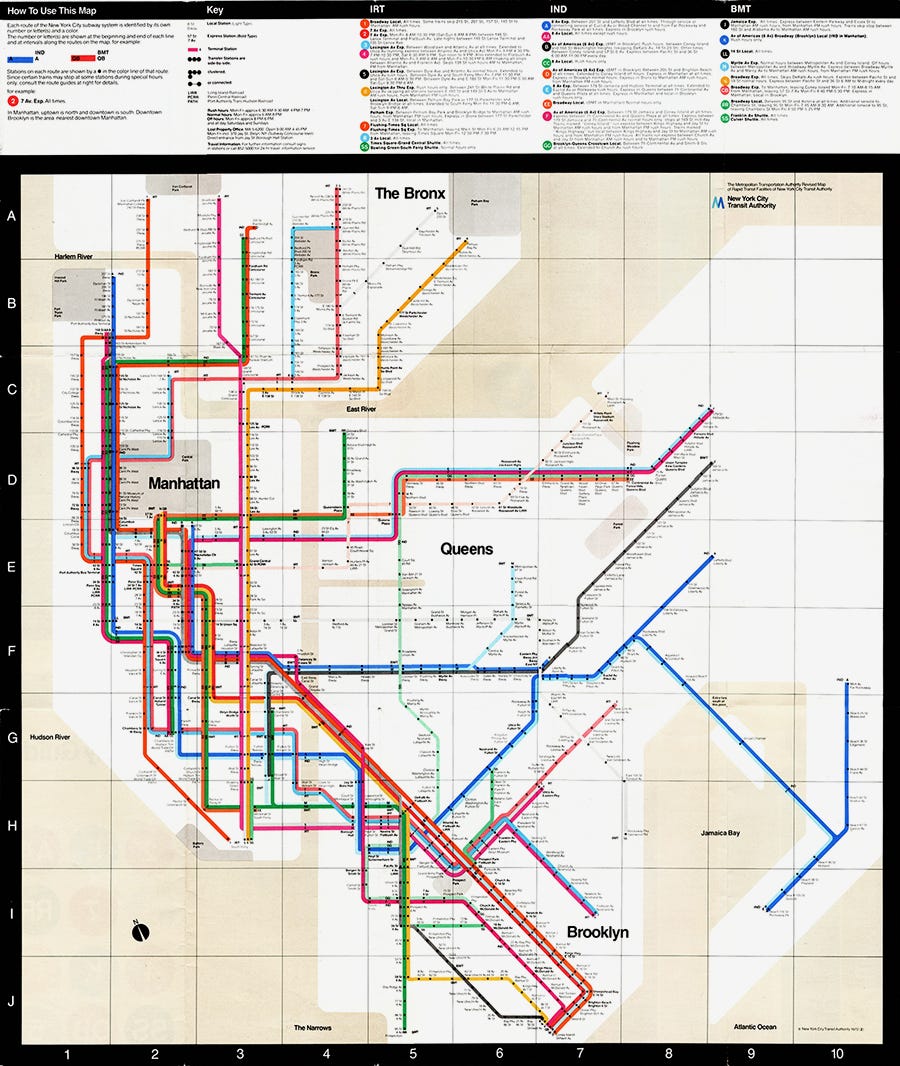
The map was praised by the design community. Sticking only to combinations of 90 and 45 degree angles, erasing the actual curved tracks and disproportionate lengths between stops, the Map became a minimalist bible and almost a blasphemous representation of the five boroughs. But the Map was never intended to be used above ground. It was supposed to simplify directional travel on the trains by removing every piece of information that was not essential to transit under the city.
New Yorkers, being New Yorkers, pushed back in outrage. Central Park was a grey square. The water was an ugly colour of beige (even though beige was THE colour of the 70s) and the proportions and lines didn’t match the maps people were used to. The City demanded Geography; Vignelli gave them data.
The back and forth of Vignelli’s map continues to this day, with the MTA still modifying the map with the occasional hat tip to the designer himself.
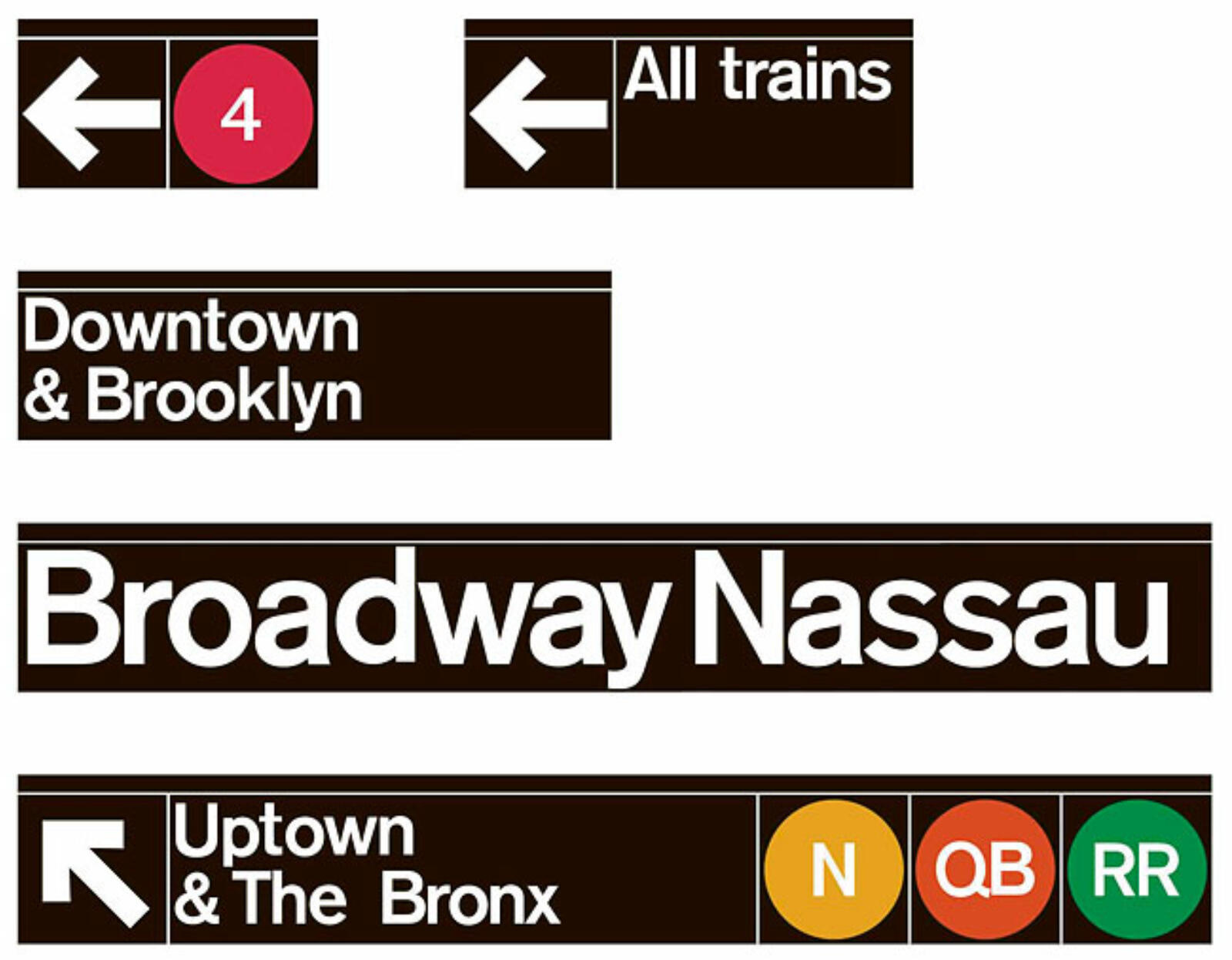
Vignelli’s (less controversial) work for the MTA also included the wayfinding system which is still in use today, famously known for its white lettering on black signage.
In 2014, and at the age of 83, Massimo Vignelli died in New York City.
Design is Fucking Hard
I remember when my friend Jeff gave me a license key to Adobe Creative Suite in 2013. (Hoping the statute of limitations has passed on this one!).
I loved photoshop. Playing with all the features and layers were amazing, and in a truly non-destructive workflow, I had no fear that what I was doing could not be reversed.
Then I moved to the rest of the suite. And in a moment of pure hubris, I tried illustrator. It’s now 2026 and I still have a Creative Cloud License, yet still can’t figure out the pen tool.
But watching the program and software suite evolve over the last 13 years gave me an admiration for the designers who continually mastered it. People like Aaron Draplin, Tobias Van Schneider, Dan Mall and Karl Hebert were gods to me; not only did they have a creative eye for the everyday, they were able to translate that to a digital design system in a way that I envied.
I truly believe that if you want to appreciate the work that goes into something, you have to try it yourself. Understanding what a challenge it is to design (both the mechanics and the process) is something that has given me a love for seeing it in the everyday.
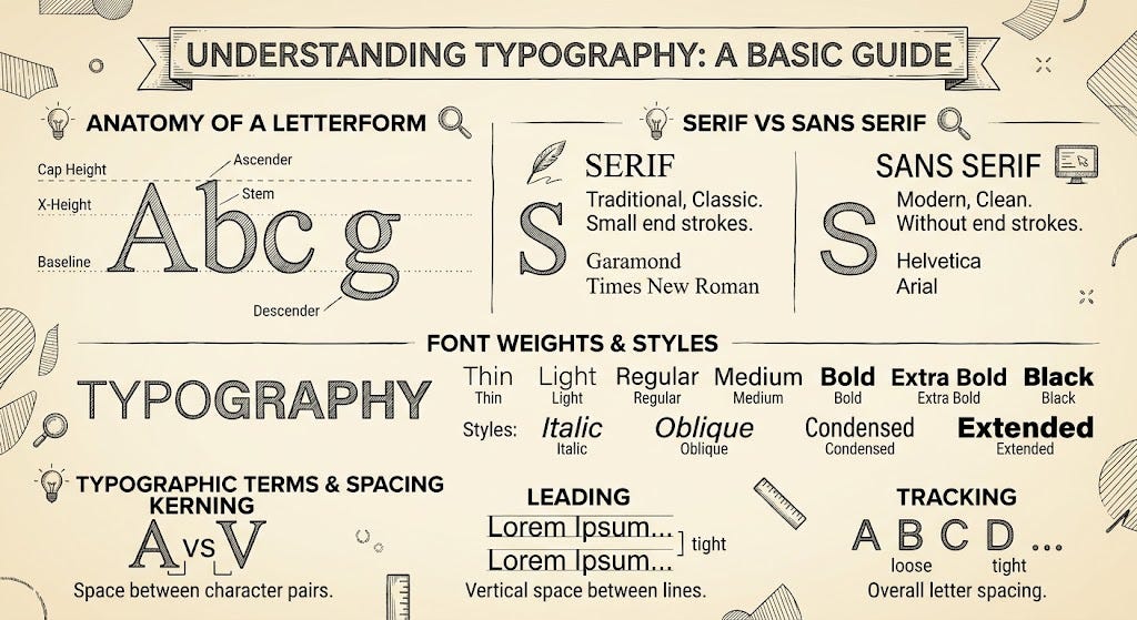
I think design is also one of those things you have to look for. Typography, for example, hides in the mundane. Humans read an estimated 1,000 words every single day, and I bet not one of you could tell me a single font you saw in the last 24 hours.
The Design Ship is (at risk of) Crashing
AI is getting increasingly good at adopting the aesthetic of a system of design. As text-based GPT programs master their craft and then turn to more complex, visual challenges, we will only see this mimicry get better and better.
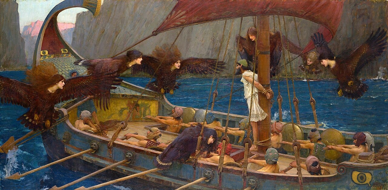
But the issue with AI is that it completely bypasses the discipline required to achieve it. It’s a seductive shortcut, a siren, leading design ships into an area of rocky waters as they lose their creative edge. If we aren’t careful, we risk accepting a world flooded with designs that look perfectly structured on the surface but lack the deep, human-centric logic that actually makes them communicative and functional.
There’s another risk too: we lose the skillset.
Ask anyone you know that has integrated AI into their workflow HOW it has changed their ability to do things the manual way, and I assure you the answer will be the same: the skills once honed to complete a task have started to dull, like that one knife in the kitchen drawer (which Vignelli probably designed).
This isn’t speculation, either. Scientists have referred to this phenomenon as cognitive atrophy. Based on the principal of cognitive offloading (removing micro-decisions from our to-do list because we simply don’t have the brain power), if we constantly put decisions on AI, we can run the risk of atrophying the areas of our brain that make those very decisions.
If we aren’t careful, we risk creating a world flooded with designs that look perfectly structured on the surface but lack the deep, human-centric logic that actually makes them functional.
THIS is why AI in design is so incredibly dangerous. Not only do we continue to push the button and create designs that are simply sloppy copies of great works, we are slowly, but surely, killing those capable of creating greatness once again.
"AI is a snapshot of the past being sold as the future."
-Hans Zimmer
Redirection
Steve jobs famously called the computer a bicycle for the mind. And if that analogy holds true, then AI is likely on the order of being a spaceX Falcon 9 rocket. We have already seen and will continue to see advancements and efficiencies we cannot simply imagine.
So, to be clear, I’m not here to voice against the use of AI in design; I think that approach would be folly. AI will allow us to rapid prototype, to try and fail at speeds our ancestors could only dream of. We don't need to reject AI entirely, but we must use it as a tool, not a crutch.
Massimo Vignelli did not leave behind a template, but a discipline. His iconic grids and stark typographic systems were never meant to be a static aesthetic endlessly replicated. They serve as symbols of a human mind wrestling with chaos until only the most essential artifacts remained.
When we prompt AI to recreate this aesthetic, we are not practicing that discipline. We are simply summoning a ghost. This is where the illusion of order becomes actively dangerous. It masks cognitive atrophy.
By outsourcing the struggle, we lose edge. We are no longer architects of intent. We are merely editors of statistical averages. Throwing a fistful of pasta against the wall and keeping the noodles that stuck.
Relying on algorithms trained on the triumphs of the past guarantees a future of automated nostalgia. Sure, the work will be beautiful, attractive, attention getting. But we risk checking ourselves into the Hotel California of creativity. Stuck in an endless loop of derivative nostalgia.
So, to the designer, to the dreamer, go out and do something hard. Make something, even if it’s shit. You might be the only thing left holding the subway car between art and atrocity.
For Massimo, and for us.
-Baron